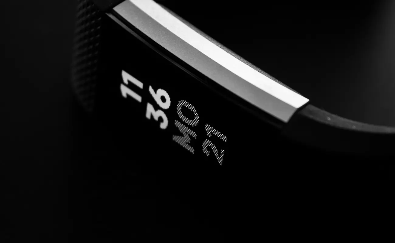
Wearables present challenges unlike other design projects. Function is a primary concern, as is size with what will be one of the smallest screens designers have ever worked with. The key is creating a design that is visually pleasing but is user-friendly and provides a functional experience. Here are 10 things to consider as you design for a wearable interface (with examples other designers are already imagining).
Think Minimal Design
One of the biggest trends in design in general is perfect for wearables – minimalism. The very same design practices you use for websites or even minimal-style print or packaging design are perfect for wearable and watch-type devices. (Here we are mostly talking about watches because of the visual design element they present.)
Everything from color to typography to imagery should be simple, straightforward and easy to read at small sizes. Use some of the concepts from flat design as well to add to the minimal style, such as bright color, high contrast and elimination of design embellishments.
Use Vibration
Wearables come with features that you may not have designed for in the past. Vibration is one of these. Simple buzz or movements can be an ideal way to design an interaction when it comes to something that a user will have against the skin.
But you need to think carefully about how these interactions work. Vibrations should be soft and happen in a way that is obvious but will not be uncomfortable or scare the user when they happen. Vibration-style interactions also need to happen infrequently. If a watch buzzes every minute, the user will quickly become frustrated and abandon the product.
Voice Controls are Essential
While we have talked about designing for tap and touch interaction for a while because of smartphones, now the conversation will shift to voice activated controls. Think about it this way, with a screen that small, who is going to want to tap it? Voice is easier.
When designing the interactions of your app or website that will appear on a watch-style device, such as the Apple Watch, voice should be a top consideration. Voice is an essential part of the Apple design, for example, with Siri as a native app that activates and waits for a command every time you raise your wrist. This feature provides a convenience factor that you must take into consideration.
Type Needs to be Simple
Repeat after me: Sans serif. When it comes to type on wearable devices, that is all you need to know. It may sound boring, but a simple sans serif with a uniform stroke width is one of the easiest and most readable options.
Avoid typefaces that are ultra light or condensed because the light coming through the watch face may not be enough to ensure readability. Conversely, be careful with super thick, black or bold styles. Stick to a typeface with a moderate stroke with and somewhat wide letterforms. (Helvetica is an ideal, albeit overused, option.)
Colors Need to Have High Contrast
Every color on a small screen needs meaning. Part of this meaning will come in the form of contrast and making elements easier to read.
Colors can be used to represent tappable elements that demand interaction or as a backdrop for a text command. The key is sharp contrast. Consider the environment in which these devices will be used – in sunlight, in dark rooms – and design so that every letter is easy to read in any condition.
Avoid pastels or colors with low saturation. Bright hues and highly saturated colors will work best. Pair these with white or black type for optimum readability.
Make It Easy
Every wearable device will be a little different. Consider the interface and physical components for each as you design. The Apple Watch comes with a “digital crown,” a wheel that can zoom or scroll through information on the screen.
The design should work with all the physical parts that a device includes. It should be easy to look at and more importantly easy to use. Function should be intuitive.
Visuals Should Mirror Design In Other Places
The visual plan for a watch screen should mirror the design interface of other devices. Yes, the screen will be limited and interactions will focus on a single action, but the overall aesthetic should have a similar look and feel.
It goes back to the popularity of minimalistic design. It’s a technique that works on both types of devices. The same is true with many principles of flat design. For this reason, these trends will continue to stick around and become key factors for designers creating for these tiny screens.
Make It Cool and Trendy
This may not sound like a big deal, but wearables are something that users connect to their identities. Not only does the actual device need to have a certain look and feel, but the interface needs to match that style.
The information on the screen has to be as nice as the device itself. With the Apple Watch, the interface is super-simple, has clean lines and very few bells and whistles. The interface for watch apps should use the same model, so that the information on the screen looks like it actually belongs there.
One Visual Thought Per Screen
Every pixel matters in a way that is hard to explain. There just is not enough room on a watch-sized screen to include every element from a desktop or mobile design. So think about what you don’t need.
These screens can range in size from 320 pixels square to 128 pixels square. This is too small to just shrink the design; you have to fully change it for a wearable device. Use this concept: One visual thought per screen.


